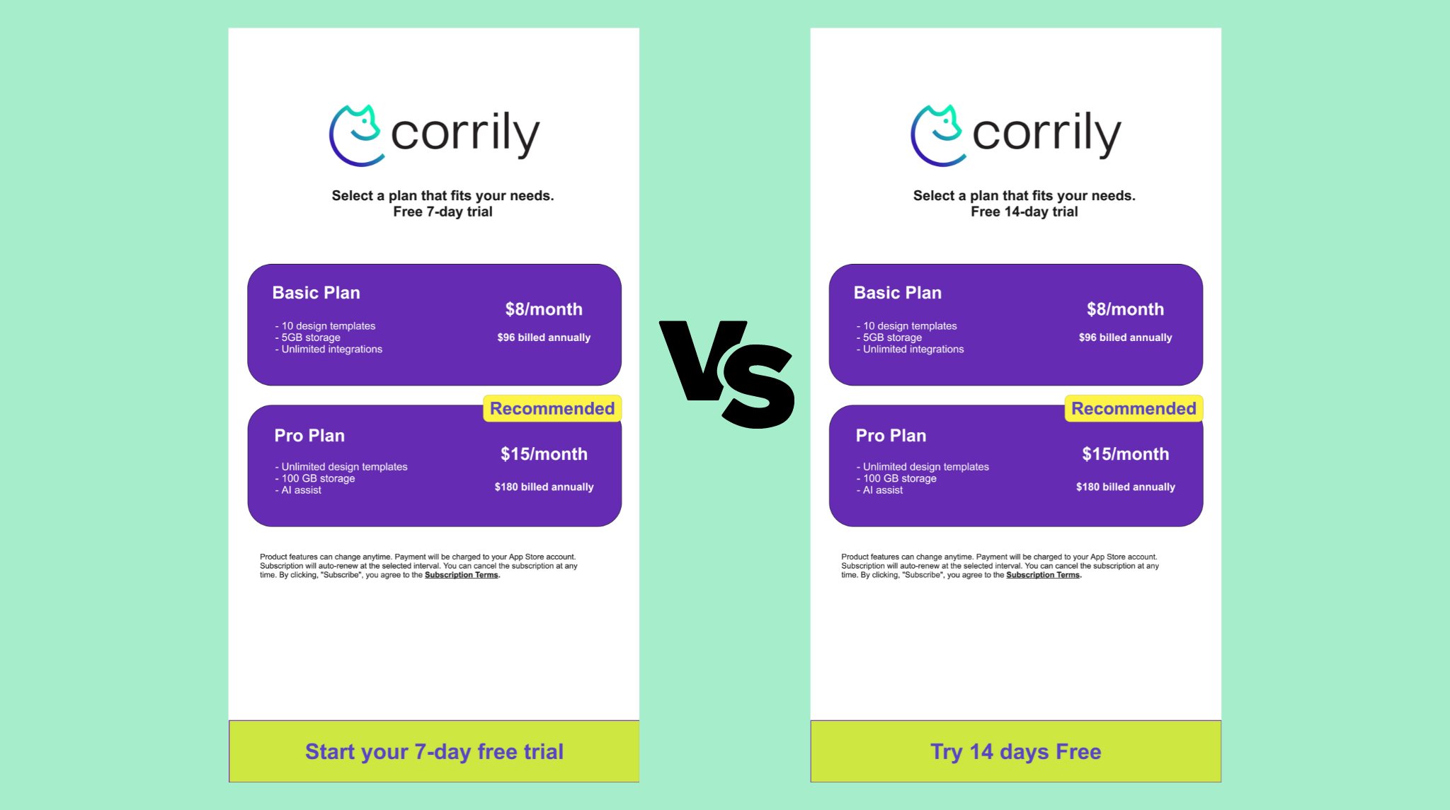
In the competitive world of subscription-based businesses, an effective paywall strategy is essential for maximizing conversions and revenue. This post delves into 10 detailed best practices for optimizing subscription paywalls, supported by examples from successful mid-tier companies.
1. Personalized Paywall Experiences
Personalization is key to making a paywall effective. By analyzing user behavior and preferences, businesses can tailor their paywall messages and offers to individual users. This approach not only enhances user engagement by making the content more relevant but also increases the perceived value of the subscription. Personalized paywalls can adapt in real-time, offering different users unique experiences based on their interactions.
Example: Scribd
Scribd enhances user experience by personalizing its paywall recommendations. Analyzing users' reading patterns, Scribd suggests subscription plans that align with individual preferences, thereby increasing the likelihood of conversion.
2. Dynamic Paywall Adaptation
Dynamic paywalls are designed to adjust based on user engagement, optimizing the timing and context of subscription offers. This strategy involves varying the paywall's exposure based on factors like the number of articles read or time spent on the platform. It's a flexible approach that targets potential subscribers more effectively by responding to their level of interest and engagement.
Example: Medium
Medium's dynamic paywall adjusts based on how much a user interacts with content. More engaged readers encounter the paywall sooner, capturing their interest at peak engagement and significantly increasing subscription rates.
3. Data-Driven Subscription Offers
Utilizing data to inform subscription offers is a powerful approach. By analyzing user behaviors and preferences, companies can craft subscription packages that resonate with different audience segments. This data-driven strategy ensures that the offers are relevant and appealing, increasing the likelihood of users taking up a subscription.
Example: Blinkist
Blinkist leverages user data to offer tailored premium subscriptions. By understanding which book summaries are most popular among different user groups, they create targeted offers that directly address the interests of their audience.
4. Comprehensive A/B Testing
A/B testing is crucial for optimizing paywall elements. By testing different versions of offers, pricing, and messaging, businesses can identify what appeals most to their audience. This continuous process of testing and refinement helps in fine-tuning the paywall to maximize conversions.
Example: Skillshare
Skillshare employs A/B testing to refine its paywall strategies. By experimenting with different messaging and offers, they gain insights into what drives their users to upgrade, allowing them to adapt their approach for better results.
5. Segmented and Targeted Messaging
Segmented messaging enhances the effectiveness of a paywall by ensuring that each user receives an offer that resonates with their specific interests and needs. This approach divides the audience into different segments based on factors like behavior, demographics, or past interactions, and targets them with customized messaging.
Example: Headspace
Headspace uses segmented messaging strategies to target different groups of users. By understanding the varying needs of their audience, such as stress relief or better sleep, they tailor their paywall messages to appeal directly to these specific interests.
6. Social Proof Integration
Integrate social proof elements within your paywall strategy to build trust and credibility. Display testimonials, user reviews, or subscriber success stories to showcase the value of your subscription, instilling confidence and encouraging conversions.
Example: Peloton
Peloton strategically incorporates social proof by showcasing success stories from their fitness community. Real-life testimonials highlight the positive impact of their subscription plans, making the paywall more persuasive and trustworthy.
7. Intuitive Paywall Design
An intuitive and user-friendly paywall design is crucial for a smooth subscription process. Clear and straightforward paywall layouts reduce confusion and hesitation, making it easier for users to understand the value of subscribing and how to do so.
Example: Canva
Canva’s paywall is designed for clarity and ease of use. With a straightforward layout and clear call-to-actions, it guides users effortlessly through the process of subscribing, thereby reducing drop-offs and increasing conversion rates.
8. Time-Sensitive Subscription Promotions
Implementing time-sensitive offers creates a sense of urgency, encouraging users to make quick decisions. This approach can effectively boost short-term conversion rates by leveraging the psychological principle of scarcity and urgency.
Example: Wix
Wix frequently employs limited-time discounts to encourage quick decision-making. These offers, often tied to special events or holidays, create urgency and have been successful in increasing subscription sign-ups.
9. Clear Subscription Value Proposition
Clearly communicating the value proposition of a subscription is essential. This involves outlining the benefits and exclusive features available to subscribers. A compelling value proposition differentiates the paid version from free alternatives and persuades users of the subscription's worth.
Example: Grammarly
Grammarly articulates its value proposition by highlighting advanced features like genre-specific writing style checks and plagiarism detection, which are available only to premium subscribers. This clear communication effectively demonstrates the added value of upgrading.
10. Diverse Subscription Plans
Offering a variety of subscription plans caters to a broader audience by accommodating different user preferences and budgets. This approach includes providing different tiers of service, each with its own set of features and pricing, allowing users to choose the option that best fits their needs.
Example: Duolingo Duolingo offers multiple subscription options, including a free tier and Duolingo Plus. This approach caters to a wide range of learners, from casual users to those seeking an ad-free experience with additional features.
These best practices, illustrated with real-world examples, offer a blueprint for increasing conversion rates and revenue.
Optimize Subscription Paywalls
There are multiple ways to optimize your subscription model and your paywall strategies. To test the effectiveness of your strategies, consider leveraging Corrily's Paywall Experimentation and Segmentation capabilities.
With Paywall Experimentation and Segmentation, you can test various aspects of your paywall and pricing pages, tailor paywalls for different markets, user segments, or even cohorts of users.


